
Smarter Product Discovery.
A discoverability - problem in disguise
The platform had a discoverability problem. Users weren't finding or engaging with the full range of hiring services available to them — which meant lower engagement and revenue left on the table. I had full design ownership over this initiative: responsible for the discovery process, design direction, component definitions, and the design system work that came with it.
When I joined the project, there was no defined solution — only behavioral data pointing at a problem and a team that couldn't agree on what the problem actually was.
From navigation problem to personalization problem
Two product discovery workshops with developers, stakeholders, and designers using the Idea Napkin method — a framework that forces teams to define a feature's value, target user, and strategic fit before any solutions are proposed. With teams coming in with different definitions of the problem, I needed a structured way to reach a shared starting point first.
I also ran a competitor analysis focused on Upwork and Fiverr — not to copy their patterns, but to identify where they created discovery moments and where they fell short.
We came in thinking this was a navigation and IA problem. We left discovery knowing it was a personalization problem. That reframe changed everything about the solution we designed.
What was broken
- Wrong metrics surfaced. Users needed help finding the right hiring model — not a better browse experience. The existing surface didn't match how users made decisions.
- No way to act. Even when users found relevant services, the path to commitment was unclear. The insight and the action were disconnected.
- Poor hierarchy. Dense, unscanned. Users with limited time couldn't quickly identify what applied to them.
Holding the line on a feature worth shipping
Midway through the project, stakeholders pushed to cut the feature entirely — their position was that it wouldn't drive meaningful value and the engineering investment wasn't worth it.
The PM and I disagreed. The research was pointing clearly at a real unmet need, and the competitor analysis showed that platforms solving this problem were seeing real engagement gains. We made the case to continue — not by arguing for the design, but by arguing for what the data said.
That decision to hold the line and ship is what the $850K outcome is built on.
The process
Discovery Workshop |
Structured the session around the Idea Napkin method to get alignment on the problem before anyone proposed solutions. This prevented us from designing in four different directions at once — which given the stakeholder tension, would have been fatal. |
Competitor Analysis |
Analysed how Upwork and Fiverr handled product discovery — specifically how they surfaced relevant services to users who didn't know what to search for. The goal was to find where existing solutions fell short, and design into that gap. |
Wireframing |
I started by designing wireframes to outline the feature’s structure and functionality, then created interactive prototypes for stakeholder feedback. Working with the writing team, I refined the copy for clarity and brand alignment. I also built a components library to standardize elements, ensuring a consistent and efficient workflow from concept to final product. |
Usability Testing |
Led user interviews with the research team, followed by A/B testing to pressure-test the interaction model. Ran synthesis sessions not to produce a list of findings, but to extract a prioritised set of design decisions. The combination of qualitative and quantitative data gave us enough confidence to commit to the quiz model. |
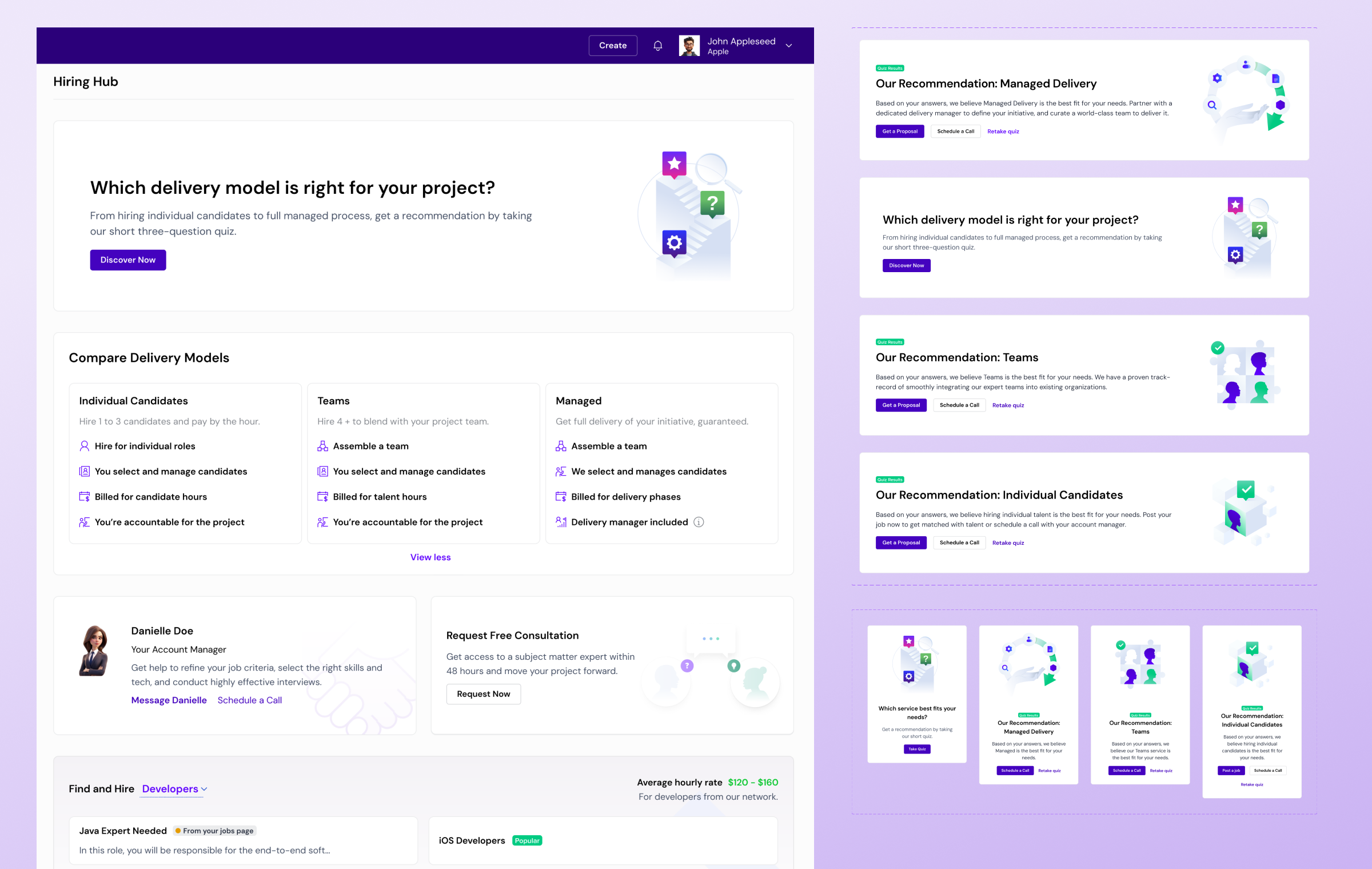
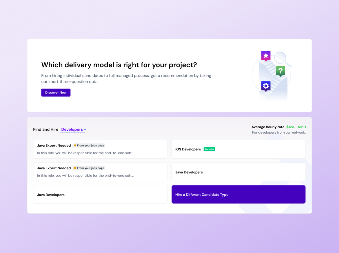
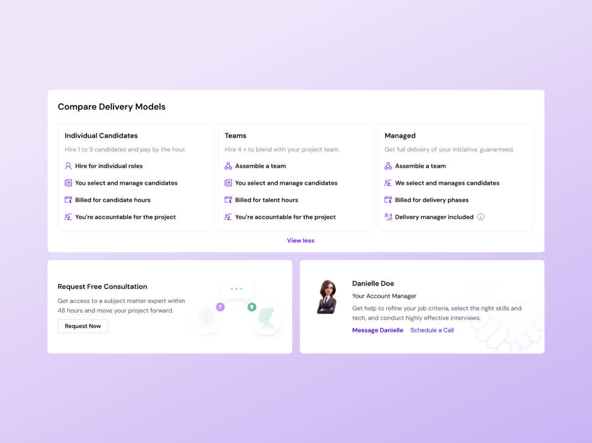
Solution - The core design bet
A three-question quiz that matches users to the right hiring model — Individual Candidates, Teams, or Managed Delivery — based on their project needs. Surfaced as a persistent entry point on the Hiring Hub, with recommendation results that give users a clear next action.
Quiz entry + browse widget
Two layers of discovery working together — the quiz for users who don't know what they need, the widget for users who already have a direction.
Recommendation + comparison
Side-by-side delivery model breakdown with trust signals — free consultation CTA and a named account manager. Users needed to feel informed, not pushed.
Filters require users to know what they're looking for. Our research showed they didn't. A quiz inverts the model — it asks users about their situation, then surfaces what's relevant. That's the entire product logic in one decision.
Numbers that
made the case.
The gap between the quiz cohort (55%) and the overall rate (23%) is the clearest signal in the data. Users who were guided to the right service converted at more than double the rate of those who weren't — that's the recommendation system working exactly as designed.
What I'd measure next: return visit rate for users who completed the quiz — the longer-term retention signal that shows whether personalized discovery changes how users relate to the platform, not just whether it converts them on the first session.
-
$850k est.
Revenue increase
-
23%
Users posted a job within 14 days
-
31%
Posted a job through menu widget
-
55%
Who completed a quiz posted a job within 14 days
Evidence over
Opinion
I was the primary design voice on a cross-functional team with genuinely conflicting views about whether this feature should exist. Structuring the discovery process to build alignment before design started. Advocating for a research-led direction when stakeholders wanted to cut scope. Building components that merged with an existing design system — documented and handed off clearly.
Making the case, alongside the PM, to continue a feature stakeholders wanted to kill — and being accountable to that call when the data came back.