
Euka Creators iOS App.
Full ownership, zero to native
Euka is a creator monetization platform — it connects creators with brand opportunities and gives them a single place to browse, apply, and manage their work. When I came on, there was no mobile app. Just a product direction and pressure to move fast.
We made a deliberate call to launch as a PWA first: get something real into creators' hands quickly, watch what happens, then build native with actual data behind the decisions. I was the only designer across the entire arc — from the first PWA screen through the final native app. That meant setting the visual language, establishing design process with engineering, and making product calls without a design manager above me.
What the data actually said
A Discord community of over 10,000 creators already bought into Euka — direct, motivated access to real users from day one. We ran a round of user interviews from that community, focused on workflows and mobile habits. PostHog gave us the quantitative layer alongside: where users dropped off, what they weren't finding, which features went untouched.
What we found
- Navigation was broken. Creators couldn't find core features without hunting. The PWA's structure wasn't built around how they actually thought about their work.
- Onboarding was nonexistent. Users landed with no orientation. Several interview participants said the same thing: I didn't know what to do when I opened it.
- The login wall was killing early retention. We were asking creators to sign in before they'd seen any reason to. They were leaving before the app had a chance to prove its value.
- The PWA felt inconsistent and unpolished. Clunky interactions, no notifications, and a visual experience that didn't hold up next to native apps creators used every day.
Creators weren't rejecting Euka — they were bouncing before they understood it. The PWA was built around what we assumed they needed. The native app had to be built around what we observed them actually doing.
Building the system first
Before redesigning a single screen, I pushed to establish a proper design system. This wasn't the team's instinct — the pressure was to move fast and ship screens. I pushed back, because visual debt compounds quickly on a small team with no other designer, and inconsistency was already one of the things creators were calling out.
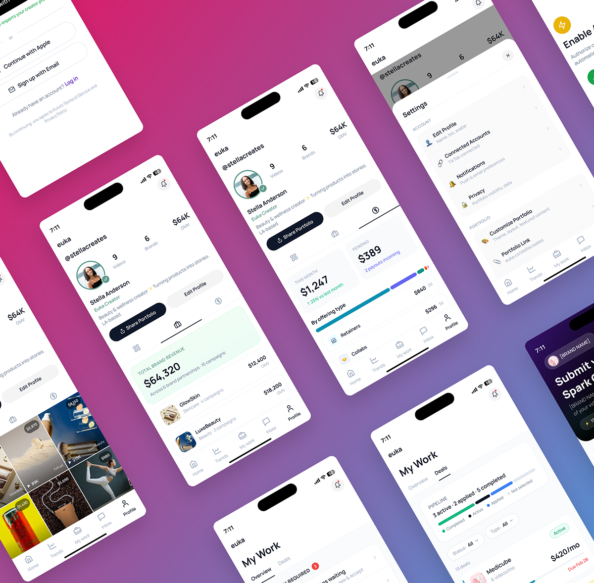
I built out a component library covering typography scale, color tokens, and core UI components — buttons, inputs, cards, navigation patterns. Every screen from that point forward pulled from the same source of truth. Beyond consistency, going native unlocked two things the PWA couldn't do: fluid, platform-native interactions and push notifications — both of which creators had been asking for and both of which directly affect whether someone comes back. I designed around those capabilities from the start, rather than just porting the PWA into a native shell.
The process
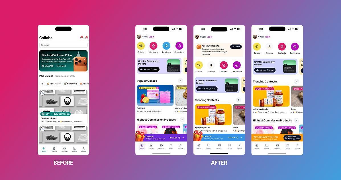
PWA |
The goal wasn't polish — it was speed and observability. I designed the PWA to be functional enough to attract early adopters and instrumented enough to generate real behavioral data. Every design decision was made with one question in mind: will this teach us something? The constraints were real: no native patterns, limited engineering bandwidth, no design system. We shipped knowing it wasn't finished. That was the right call. |
Research |
With interview findings and PostHog data, I mapped where the PWA was breaking down and why. The IA needed a rethink — I restructured navigation around how creators actually move through their work. Onboarding needed to exist — I designed a structured flow and advocated hard for it when the team's instinct was to skip it. The login wall had to go — we let anyone browse before prompting sign-in, only gating at the moment a creator was ready to apply. |
Native iOS |
With a clear direction and a design system in place, I designed the native app to feel like it belonged on iOS — following platform conventions where they helped creators move faster, departing from them where Euka needed to feel distinct. I continued to face pressure to deviate from the design system for one-off fixes throughout. I held the line consistently, because the system only works if it's actually followed. |
Three decisions that defined it
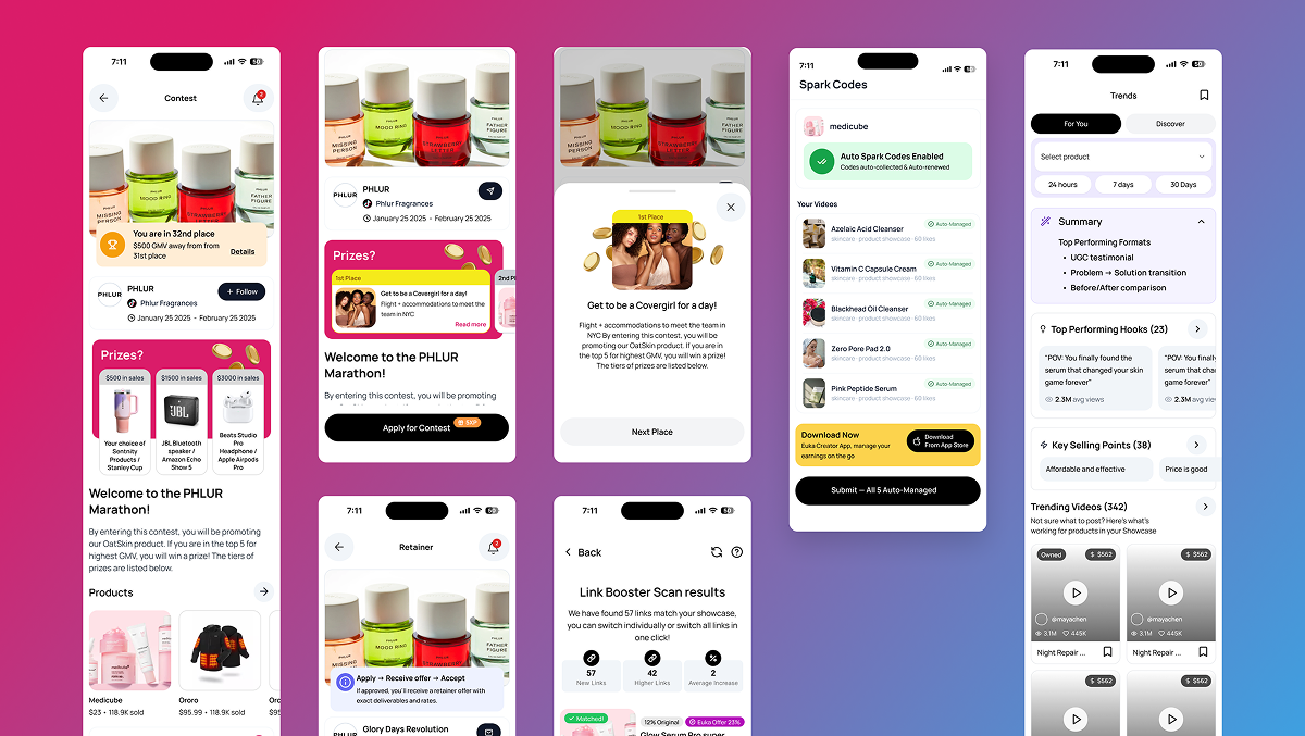
The native Euka Creators app gives creators a single place to discover brand opportunities, apply, and manage their work — from their phone, with the speed and feel of a native experience.
-
Open browsing before login. Removing the authentication wall as the first thing a new user hits was the structural change that unlocked early retention. Creators could explore real opportunities before we asked anything of them.
-
Onboarding that orients before it asks. New users get a clear picture of what Euka is and how to use it before they're dropped into the product. This directly addressed the most consistent feedback from the interview round.
-
A design system that holds. Typography, color, components — consistent, documented, shared with engineering. Visual consistency became a signal of product quality to creators who'd experienced the rougher PWA.
What the
data showed
Creators who could browse before signing in stayed significantly longer in their first sessions and returned at a higher rate. That one structural change — born directly from the research — became the clearest example of how data and design worked together on this project.
What I'd measure next: time-to-first-application — the moment a creator takes their first real action in the app — because for a monetization product, that's the engagement event that actually predicts retention.
-
10,000+
Active Creators on the native app
-
Week 5
Retention improved post login wall removal
Being the only designer in the room
I was the entire design function for this product. Making product decisions without a design manager to escalate to. Advocating for the design system when the pressure was always to just ship. Running and synthesising user research without a dedicated researcher. Aligning engineering and PM through Figma, written specs, and ongoing design reviews.
Two decisions I had to fight for: onboarding — because interview data showed creators landing lost, and the team's instinct was to skip it — and visual consistency, where I pushed back on one-off deviations from the design system throughout the project.
The hardest part of full ownership isn't the craft. It's knowing when to slow down and when to move fast — and having no one above you to make that call.