
Camp Management Platform Overhaul.
Two users, one platform
Campmap builds interactive maps for campsites. The platform serves two very different users: camp admins who need to run their site — tracking inquiries, managing parcels, handling bookings — and campers who need to find their way around and book a spot.
I was the sole designer across the entire arc. I built the MVP first, by design — we needed something real in users' hands before we could make good decisions about what to build next. PostHog went in from the start, and after enough behavioural data had accumulated, we went back and rebuilt. The constraint was real: one developer, four months, limited budget. Every design decision had to be worth building.
What PostHog showed us
The biggest signal wasn't subtle. Campers were landing in the app, getting lost, and leaving without ever completing an inquiry — the one action that directly drove revenue for camp admins. The drop-off wasn't happening at the inquiry form itself. It was happening earlier, because users couldn't find their way to it.
Camper problem
No orientation on landing. Couldn't navigate to a parcel. Inquiry flow too hard to find. Left before taking any meaningful action.
Admin problem
Working around the platform — using external tools to track things that should have lived in the product. Missing features, not bad UX.
Campers weren't failing at the inquiry step — they were failing to reach it. The platform wasn't giving them a path. That distinction changed everything about what we needed to build.
Design system before screens
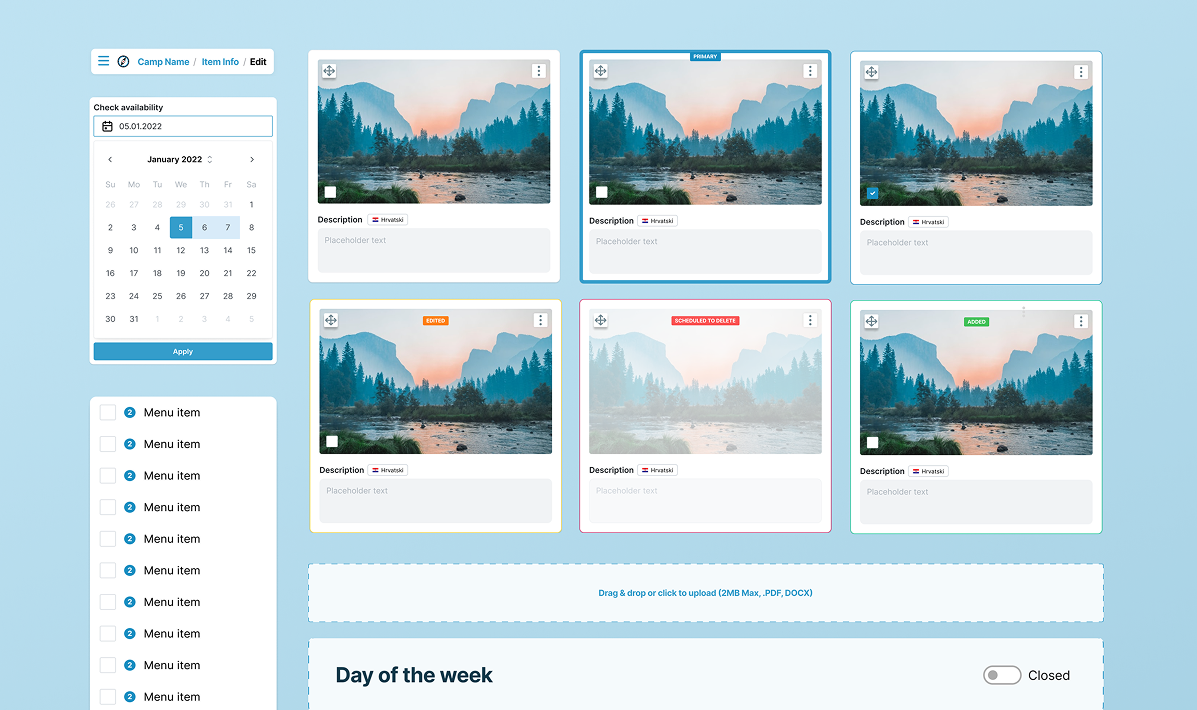
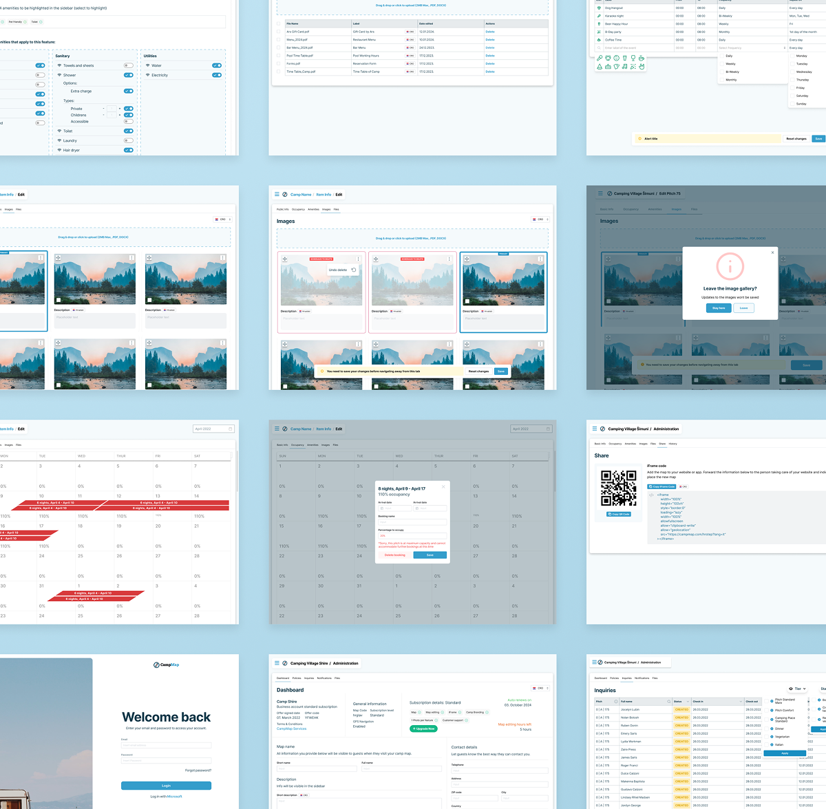
With one developer and a four-month window, the design system wasn't optional — it was the only way to move fast without creating a visual mess. I built it from scratch, covering both the admin side and the camper-facing product, which have meaningfully different interaction patterns.
The system covered typography, color tokens, spacing, and core components — inquiry cards, map overlays, navigation patterns, notification states, onboarding elements. Building this upfront meant the developer wasn't making design decisions at implementation time.
Given the budget constraints, every component had to earn its place. Complete enough to be useful, simple enough for one developer to implement consistently.
The process
MVP |
Designed for speed, not polish. The goal was to get something functional into real users' hands and start collecting behavioural data. I made deliberate simplifications — stripping features not critical for the core loop, prioritising the admin inquiry workflow and basic camp map experience. PostHog went in from day one. That was the decision that made Phase 2 possible. |
Diagnosis |
With behavioural data, I mapped the drop-off points and cross-referenced them with user intent. The finding that anchored the redesign: campers weren't failing at the inquiry step — they were failing to reach it. I also looked at the admin side — admins were working around the platform using external tools, which told us what features were missing, not just what was broken. |
Redesign |
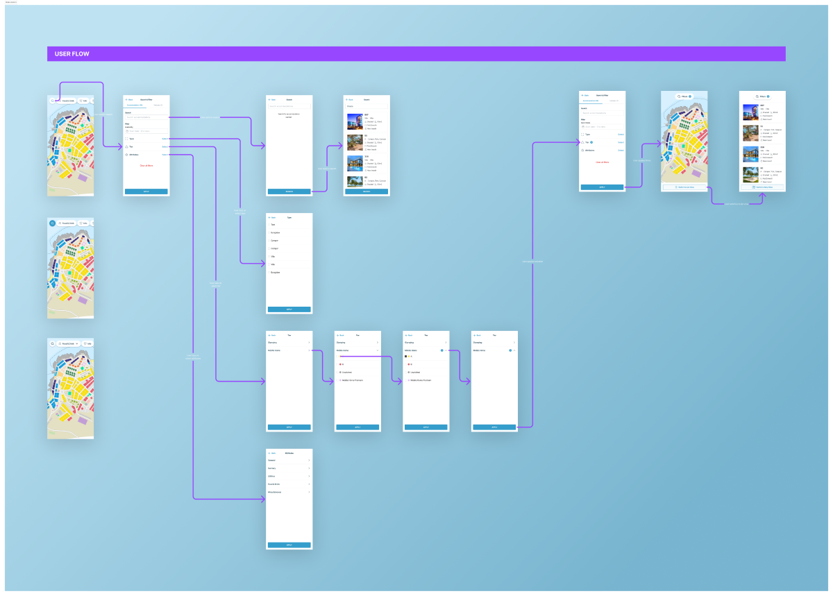
Four focus areas: GPS navigation to parcels (pushed for based on research — wasn't on the roadmap), inquiry system overhaul to surface the action earlier, structured onboarding to orient new users, and a notification system across both user types. I worked closely with the developer to sequence work around technical constraints, moving some features to a later phase when implementation cost wasn't justified by expected impact. |
Two experiences, one system
A fully redesigned platform with two distinct but coherent experiences — built on a shared design system.
For campers
Interactive map with GPS navigation to parcels, streamlined inquiry flow surfaced earlier in the journey, structured onboarding that orients new users before they explore, and notifications that close the loop on bookings.
For camp admins
Intuitive inquiry management dashboard, real-time notifications, and a cleaner IA that makes the core admin workflow — track, respond, manage — achievable without prior training.
The design system covers both sides — typography, color tokens, spacing, core components — documented and handed off to the developer as a single source of truth.
Impact
Honest about what we have
Quantitative retention and conversion data from the redesign period isn't available to share. What PostHog showed qualitatively was clear: the specific drop-off pattern we'd identified — campers abandoning before ever reaching the inquiry step — was the primary problem we designed against, and the redesigned navigation and onboarding were built directly to address it.
The more meaningful signal is structural: the platform shipped a complete design system, GPS navigation, a rebuilt inquiry flow, onboarding, and notifications — in four months, with one developer. That output required tight prioritisation and sequencing, not just design craft.
Honest about your own work
Solo designer on a constrained team meant making consequential calls without a design manager to validate them. Pushing GPS navigation onto the roadmap when it wasn't planned. Advocating for structured onboarding when the pressure was to ship features. Sequencing the design system work early against the instinct to move straight to screens. Working within the developer's capacity as a real constraint.
Being the person who'd built the original MVP and having to assess it honestly, not defensively. It's easy to be attached to your own work. The job was to look at the PostHog data and respond to what it said, not to what I'd hoped it would say.